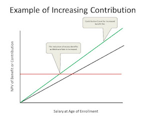
First the above chart shows the details of what we had plotted. Not the contribution increasing and the benefits as horizontal but increasing as health care inflation increases. Now let us look at three cases.
Case 1: This is the case of increasing the contribution from 3% to say 4%. Note the horizontal remains fixed but the contribution increases. Thus the salary at which a benefit occurs decreases meaning that fewer people get a free rid if you will.
Case 2: Here we increase the age of eligibility and the contributions increase and the benefits decrease.
Case 3: We look at income brackets by quintile. We show that in this case, say the balanced example, the lower two benefit and the upper two pay and the middle quintile averages out even.
Now from a policy perspective this gives a simple tool to see what the impact would be across large income groups. If we were to use this with our numerical analysis we could readily see the impact of increasing eligibility to 67 and increasing contribution to 4%. We believe that such a change over say the next few years would solve the Medicare issue. Just a thought.


