Tuesday, March 31, 2020

I am Confused

When people give numbers I always try to go back and do a sanity check. Does it make sense. Well here are two simple checks.

First the distance a sneeze travels. An MIT type published in JAMA a piece saying a sneeze goes 27 feet. Specifically:

Owing to the forward momentum of the cloud, pathogen-bearing droplets are propelled much farther than if they were emitted in isolation without a turbulent puff cloud trapping and carrying them forward. Given various combinations of an individual patient’s physiology and environmental conditions, such as humidity and temperature, the gas cloud and its payload of pathogen-bearing droplets of all sizes can travel 23 to 27 feet (7-8 m). Importantly, the range of all droplets, large and small, is extended through their interaction with and trapping within the turbulent gas cloud, compared with the commonly accepted dichotomized droplet model that does not account for the possibility of a hot and moist gas cloud. Moreover, throughout the trajectory, droplets of all sizes settle out or evaporate at rates that depend not only on their size, but also on the degree of turbulence and speed of the gas cloud, coupled with the properties of the ambient environment (temperature, humidity, and airflow).


But let us do a simple check. If one fires a ball from a cannon at some exit velocity as described in the paper the ball drops 3 feet, a reasonable distance to make a sneeze deadly, only 4 feet, not 27.  That is 7 time more distant. Now a cloud is a mass of particles so the dynamics are no different for any. Unless there is some cohesive lift effect. Unfortunately the author does not explain this almost order of magnitude difference.

Now to the doubling time. The equation below calculates the doubling cycles, not days, needed to get from 4,000 (now) to 200,000 in 15 days.
To get the doubling days we take the number of days and divie by the doubling cycles needed. Thus we get 5.64 for the number of cycles and 2.66 for the number of days. Now when we look at the actual data we calculate the doubling time as follows. We determine the daily growth rate. Then we calculate it as follows;
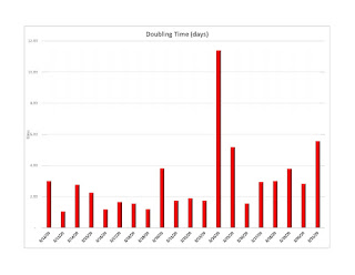
Now Item 2 is the NY Times and the presentation today. In that piece they say we are going from 4,000 deaths today to 200,000 by April 15. We showed today that the doubling time for NJ is 5.5 days or less than three doubling cycles in 15 days. The doubling time. However if you use the Government's numbers you go from 4,000 deaths today to 200,000 by April 15 then the doubling time is 2.66 days or more than six doubles. Close but it assumes a fixed and non decreasing doubling. Also when you see it is a difference of almost 3, that is a fantastic difference in the final result. But we have seen an elongation of the doubling time. Given mitigation we expect that to continue. We seem to have projections based on nothing changing. Then why is the facts on the ground so disparate from the model being used? So I am confused. The facts show 5.5 the model says 2.6 and when you exponentially look at the difference it is fantastic! Yes, I am comparing mortality with reported infection rates but if one assumes a constant mortality rate per infection we are close. So what's up.

Since the Washington group has not revealed anything about the model we are back to the Three Card Monty world.

I have always done checks like this with business plans. Somehow when there are issues like this I don't invest. But somehow we have a group betting our entire country with a model hidden in a vault somewhere. Transparency anyone.

This problem requires the insight of Richard Feynman. Remember the Shuttle disaster!

Doubling Time

We thought it may be useful to plot the doubling time. This is the number of days required to double the infections. The above is the plot. Note that today we have the second longest doubling time which is a good thing. 5.5 days to double is a sign of improvement. We have this by county as well but it becomes a bit too complicated.

Also the University of Washington affiliate that is providing the data has a site of some interest. I tried to get info on their model but to no avail. Again to do real estimates one must have real data, to the micro scale and must adapt the data as more facts come in. Otherwise we are back to Three Card Monty.

The biggest problem in all these models reminds me of something I did while in grad school. I worked designing the third back up guidance system for Apollo. There was a guy who worked alongside me who did the error analysis. Each element in the system had some error associated with it. he would determine them then add all these errors up. One day I asked how accurate the system was to get to the moon. He said that the average trajectory got them there perfectly but the standard deviation was somewhere between Jupiter and Alpha Centauri. I then asked how do we prevent this? He said: simple, make measurements along the way and course correct on what you see. he then said, no one sends a ship from Plymouth harbor to New York ballistically, never looking through a sextant. Then he said: "I hope that thing of yours works". Well it did, on Apollo 13! You see, as they say, I had "skin in the game". These models are models of averages, uncorrected by the ongoing new facts and devoid of the detailed error analysis we used a half century ago.

NJ 2020 03 31

The infections continue as shown above. However we see some decline in the rate.

The rate has halved from yesterday and the previous trend. Now we assume that some testing is going on but NJ Public Health has always lagged dramatically. The problem is excessive political hand outs but the chickens are coming home to nest.
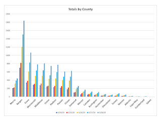
The total per county are above. Bergen still exceeds but its increase rate has fallen dramatically
The daily rates are shown above. Note the dramatic changes. The infections per PoP are below.
and the rates of change per day in the normalized ones are below:


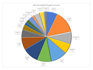
Finally the rates of change per county as a part of the whole are:
Perhaps the leveling has begun.


This is NOT a Nuclear Weapon

A writer in Science says we must form an integrated multinational program led by some select group with massive funding to have a Manhattan Project for COVID-19. Specifically he notes:

An initiative of this scale won't be easy. Extraordinary sharing of information and resources will be critical, including data on the virus, the various vaccine candidates, vaccine adjuvants, cell lines, and manufacturing advances. Allowing different efforts to follow their own leads during the early stages will take advantage of healthy competition that is vital to the scientific endeavor. We must then decide which vaccine candidates warrant further exploration purely on the basis of scientific merit. This will require drawing on work already supported by many government agencies, independent organizations like the Coalition for Epidemic Preparedness Innovations, and pharmaceutical and biotech companies to ensure that no potentially important candidate vaccines are missed. Only then can we start to narrow in on those candidates to be advanced through all clinical trial phases. This shortlist also needs to be based on which candidates can be developed, approved, and manufactured most efficiently.

Unfortunately the author in my opinion is clueless. The Manhattan Project was a secretive single focused technical program to implement a weapon. The  COVID-19 effort is a highly distributed effort interconnected in an open manner examining a multiplicity of approaches and leveraging off the open market capabilities of many entities. Any singularly focused and led effort of an international scale will be a disaster. Just look at the WHO. Their gross incompetence, in my opinion, frankly led to this.

Models and Complexity

The NY Times alleges that the Government is to release the models today. We frankly have no idea what that means. The description, the results, the source code, the underlying methodology? Since it is the Government they also have no idea what they are doing.

Let's give a simple yet complex example. Namely how does one model the transfer of the virus. Consider the example below:

Here we have an example of person to person infection. The infected individual can infect an uninfected by two means. First by aerosolizing the virus and transferring by air directly. That could be stopped by a mask. However proximity and time continuity is essential for this path to function. Second, by secondary touching. Namely the virus transferred say by hand to a surface, then the second person must touch the surface at the right spot in the right time period and transfer to their hand and then to their face to start the process. Gloves and hand washing stops that transfer.

We now above show a model for this process. Namely each step has a probability and each step has a mitigation element. We can then estimate the probability of infection from one person to another at a specific time period in a specific table surface at a specific temperature. Lots of assumptions.

Then if we want a model we have to assume that there exists an ensemble of people al functioning in some statistically similar manner. I think one starts to get the point. Assume, assume, assume etc

The issues continue since how this happens in a NYC subway is not how this happens in Scranton, and less so say in Bangor. But, and this is critical, this simple example is at the very heart of the model.

Problems like this were considered a century ago when examining statistical thermodynamics. It became an element of Einstein's Nobel Prize winning paper on Brownian Motion. Unfortunately the application to pandemics is grossly wanting.

As the above NY Times article states:

The models used by the White House team are standard epidemiological tools but are not precise, as the results can vary widely depending on how closely people follow the guidelines. In other words, the assumptions built into the models can shape the results.

This is an understatement. Having designed and tested such models and examined hundreds of others, and also understanding some of the dynamics of this virus, the simple answer is that no one has a real clue. Yet the two steps shown above of distance and hand protection are the best we can come up with now. My grandmother, Hattie Kruger, told me this seventy plus years ago from here experience in dealing with TB and the Spanish flu in New York. She lived to 90, so believe your grandmother. Thanks Hattie!

Monday, March 30, 2020

Three Card Monty

There are a set of "models" out there which are driving policy. I suspect that every politician is clueless and thus just take the words as if sent down from Delphi. On the other hand it is akin to a three card Monty game on the streets of NYC. Shuffle the cards, place your bet, guess where the ace went!

These "models" should, nay must. be made public, so that we can all see the assumptions. For example in the simple model above we assume we do not know a(t), such as a parameter in the pandemic model. We then apply a system identification routine to estimate a(t) based on the actual data as it is gathered and then adjust the model accordingly. I did this for Apollo guidance over fifty years ago, and my first book covered this. I suspect these models do not adjust accordingly.

The current scheme is we have some wizards secreting a model and whispering the result. NIH and CDC apparently do not have this expertise, nor would one expect in NIH, but CDC?

The solution is simple, set the models loose, let any and all who want to take a shot at them do so. Also we need the raw data in a readily useful form. The problem is that anyone truly competent in the field of dynamic estimation of systems with unknown variables can and should be involved. Otherwise it is a three card Monty game, no one trusts the numbers. Worse, we have experts in other fields mouthing off as if these numbers are from the mount. They are not.

NJ 2020 03 30

The infected continue to climb, the rate of increase in still 20-30% per day.
The day by day changes per county are below:
Overall there is an increasing rate. Part of the problem may be delayed or improperly timed reports.
The total per county are above. Bergen dominates. But from Somerset down there is almost negligble counts and growth.
On a per PoP basis by county above we see the bottom 4 are truly almost lacking in infection.
The above are the percent increase normalized. They are somewhat consistent and thus independent of PoP density. This is a classic modelling issue.

The above are the daily normalized changes by county. The Bergen numbers are startling, PoP density is lower than Union and Hudson.

Sunday, March 29, 2020

Some Thoughts on the Pandemic

In the field of marketing one looks to get a target market. To do so we need both demographic and psychographic measures as who in turn has a propensity to buy so that we can then promote and persuade this group. By understanding their demographics and psychographics we know what to say and where to say it.


Now with COVID-19 we can apply the same techniques in a rather simple manner. If we know the infected we then just use their social media train. From that we get both elements plus we get all their contacts. We can then cross tab the results and find out the clusters and better focus our approach. Perhaps it is a male, 23-35 years of age living in Bushwick who takes the A train to 42nd street each day. Just a guess. But the data is there. Instead of fallacious epidemiological data methods, often rant with useless assumptions and erroneous parameters, we get targeting data based upon current factual relationships and understandings.

Then we can reverse engineer the social media platform to target the next anticipated infected to hopefully quasi-quarantine them. Thus instead of a sledge hammer a la Trump, we can use our brain and data readily available to focus on remediation.

Just a thought for the day. Probably will not work since these platforms are not know to be supportive of the prosperity of the US population.

NJ 2020 03 29

The above is the total as of 1PM today. The growth continues.
However the rate of growth is slowing somewhat consistently.
The total by county are above. Bergen still is the hot spot. Essex, Monmouth, Middlesex, Union, Hudson, Passaic and Ocean are secondary. From Morris down the total are not that extreme.
The above is the % change total by county.
The above is the infections per PoP. Bergen is clearly the hot spot. 0.23% of the population is infected. When I see these facts and then hear Fauci I wonder what is the basis for his numbers. NJ is second in total but the infections are in a few hot spots.
This is the % PoP per day change.
Finally the above is the Normalized Daily % change for today by County. One can clearly see the targeting that must be done.

Saturday, March 28, 2020

It's Beginning

The State of Rhode Island is stopping New York drivers and forcing 14 day quarantines. The NY Sun reports with a video of the Governor and states:

The order by Governor Raimondo of Rhode Island to have state police pull over all cars entering the Ocean State with New York license plates opens a new front in the war on the coronavirus. It’s not our purpose here to quarrel with the governor. She leads the second most densely populated state in the nation. Florida, Maryland, Texas, and South Carolina are reportedly also targeting New Yorkers. These policies, though, skate close to a constitutional red line. That’s because traveling freely among the several states is enshrined in constitutional case law as a fundamental right. The courts have differed over the years on which clause of the Constitution the right to travel among the states is seated — the equal protection clause, say, or the privileges and immunities clause. If the right is lost or trifled with, though, the very fabric of America would frayed or torn.

There is the unlawful search and seizure issue as well as due process as well as interstate commerce, but after all this is Rhode Island. It makes New Jersey look like the most honest state in the Union.

This things is really getting out of hand and quickly. I wonder if the Coast Guard will be stopping ships leaving the quarantined states as well, say blowing them out of the water!

An Interesting Analysis

The above is an interesting analysis. It is a model so take it for that. This is the daily % change versus day from start of the infection, assuming one person, and parameterized on the contact activity ratio. Thus lots of contact it doubles every day and after 26 days it starts to die out since everyone will be infected. In contrast if you consider a low contact activity ratio you get a slow drawn out curve that takes about 45 days to start to decline.

If one looks at NJ one may suspect this to be the case. However if you can drive down the activity ration, namely keep the teenagers off the street, you may get this down even faster. Perhaps that is what is starting in Morris County, hopefully.

Down with the Quarantine and Up with the Facts! To the Barricades, Allons, allons, mes enfants...toujours la liberte!

"Escape from New York"

For those who may recall this famous film, NYC was turned into a penal colony. Now the President is threatening to turn NY, NJ, CT and effectively all of New England into a penal colony. Science not withstanding, that would isolate almost 100 million people, since other than the Atlantic Ocean, there would be no land escape.

No scientific explanation, not data, just shout it out. Panic in a crowded theater. Somehow this virus has created a massive explosion of reckless talk. Are we being invaded by monsters from outer space, an asteroid, what next? There are times for judicious talk and leadership, isolating a third of the country while hopping on a ride for a photo-op is hardly presidential.

Pity folks.

NJ 2020 03 28

The total for the state continue to rise. But as we can see it is dominated by counties proximate to NYC.
The above demonstrates the fact. The far out counties are almost nominal, namely from Mercer downwards. Even Morris seems to be abating. However Bergen, Essex, Monmouth and to Ocean we see continual growth.
Overall the average daily % change has been stable at about 25%. We expect that may last another week before it decreases.
The above is the % day change by county. Morris is dropping quickly. Compare that to Mercer and now Warren. Salem is stable at a low count.

Trump has allegedly threatened a quarantine for NY, NJ and CT, basically closing off all of New England in effect. That is counter effective. The issue is that we are to train people how to behave. This data shows some understand and other seem to be clueless.

Looks Great

Abbott Labs has a table top 5 minute COVID-19 test system. They note:

Abbott has received emergency use authorization (EUA) from the U.S. Food and Drug Administration (FDA) for the fastest available molecular point-of-care test for the detection of novel coronavirus (COVID-19), delivering positive results in as little as five minutes and negative results in 13 minutes. What makes this test so different is where it can be used: outside the four walls of a traditional hospital such as in the physicians' office or urgent care clinics. The new Abbott ID NOW COVID-19 test runs on Abbott's ID NOWTM platform—a lightweight box (6.6 pounds and the size of a small toaster) that can sit in a variety of locations. Because of its small size, it can be used in more non-traditional places where people can have their results in a matter of minutes, bringing an alternate testing technology to combat the novel coronavirus.

If this does work it, and it is a more universal testing platform, then this is a true game changer. It opens the field up for  real time universal tests as is needed. It MUST BE MANDATORY for any entering the country! In fact even before boarding a flight to the US or at Border crossings.

Friday, March 27, 2020

NJ 2020 03 27


The total for the state is shown above as of today. The daily percent changes are shown below.

The good news is the reduced daily rate of change. The per county numbers are below.

Finally the daily percent changes by county are shown below:
Clearly Bergen is the largest and that is where it started with group transfer. Morris which is demographically similar has apparently managed to keep it under some control. Demographically Union, Hudson, and Passaic are similar. As the nexus to NYC decreases outside of these there is a dramatic fall off.

It is essential to have at least county by county.

Thursday, March 26, 2020

Reckless Research?

Models are just that, models. I have multiple models. Many of them are financial models for start up companies. But what we then do as things start to happen is adjust the models to reflect the facts as they occur. The Imperial College of London is a model ten days ago which predicted an apocalypse. Now a short tens days later they seem to be dramatically backtracking stating:

 The modelling showed that implementing measures early on can have a dramatic impact. If all countries were to adopt this strategy at 0.2 deaths per 100,000 population per week, 95 per cent of the deaths could be averted, saving 38.7 million lives.

 In my opinion and in my experience this is grossly reckless. We really do not know enough about the propagation of this virus to make any reliable predictions. As we have been seeing in New York, Boston and Washington we have some 30,000, 500, and 550 respectively.

New York is larger but the attack rate is substantially higher. One cannot say the cities are materially different in population risks.

When we see these facts and then when we see the calamities from the London folks we then lose any and all trust that they can make any credible statements. Reckless?

BTW, we tagged this when it came out and the NY Times spread it like a call in a theater.

In a recent NEJM report the authors rationally state:

Thus, several questions are especially critical. 
First, what is the full spectrum of disease severity (which can range from asymptomatic, to symptomatic-but-mild, to severe, to requiring hospitalization, to fatal)?
Second, how transmissible is the virus?
Third, who are the infectors — how do the infected person’s age, the severity of illness, and other characteristics of a case affect the risk of transmitting the infection to others? Of vital interest is the role that asymptomatic or presymptomatic infected persons play in transmission. When and for how long is the virus present in respiratory secretions?
And fourth, what are the risk factors for severe illness or death? And how can we identify groups most likely to have poor outcomes so that we can focus prevention and treatment efforts?

Reasonable. And making projections without even these simple steps, is well, I said what my opinion is.


NJ Updates

We start with the state total daily increase as below:
The we look at the County Daily increases:

Now finally the total numbers:

Clearly we are seeing a significant daily increase today. The per county numbers tell somewhat a geographic story.Hudson and Union are proximate to New York. Bergen is the canary in this scenario.

Politically Correct Fact Hiding: A Potentially Lethal Decision

It appears that New York City is refusing to release details of COVID-19 infections. This is akin to hiding cholera in London and allowing massive spread. ProPublica notes:


Instead New York, along with several other state and county governments around the country, has released daily data only on the county, or borough, level. That means there is just one figure for COVID-19 cases in all of Kings County — Brooklyn — which has a population larger than 15 states. The roughly 4,600 confirmed COVID-19 cases among Brooklyn’s 2.6 million residents account for 8% of the confirmed cases in the entire country. There is also just one coronavirus case figure for the 2.2 million residents of Queens, where there are just over 5,000 confirmed cases. The lack of detailed information makes it difficult for medical workers, journalists and the public to establish whether particular communities in the city are being harder hit and to get beyond anecdotal accounts of which of the city’s roughly 60 hospitals are already overwhelmed.

As we have noted again and again, testing and data are essential. Models are meaningless without validation and validation demands data.

To quote my father, "Prior planning prevents poor performance" That can only be done with data. In my opinion and based upon my experience the refusal to make public the data is making the problem worse! 

Also without this data, how, one wonders, can those wizards at the NY Times ethically present their alleged models?

Interesting Result

The NIH Director's Blog has an interesting read. Suggest looking at it. He states:

The researchers went on to analyze genomic data related to the overall molecular structure, or backbone, of the new coronavirus. Their analysis showed that the backbone of the new coronavirus’s genome most closely resembles that of a bat coronavirus discovered after the COVID-19 pandemic began. However, the region that binds ACE2 resembles a novel virus found in pangolins, a strange-looking animal sometimes called a scaly anteater. This provides additional evidence that the coronavirus that causes COVID-19 almost certainly originated in nature. If the new coronavirus had been manufactured in a lab, scientists most likely would have used the backbones of coronaviruses already known to cause serious diseases in humans. So, what is the natural origin of the novel coronavirus responsible for the COVID-19 pandemic? The researchers don’t yet have a precise answer. But they do offer two possible scenarios. In the first scenario, as the new coronavirus evolved in its natural hosts, possibly bats or pangolins, its spike proteins mutated to bind to molecules similar in structure to the human ACE2 protein, thereby enabling it to infect human cells. This scenario seems to fit other recent outbreaks of coronavirus-caused disease in humans, such as SARS, which arose from cat-like civets; and Middle East respiratory syndrome (MERS), which arose from camels. The second scenario is that the new coronavirus crossed from animals into humans before it became capable of causing human disease. Then, as a result of gradual evolutionary changes over years or perhaps decades, the virus eventually gained the ability to spread from human-to-human and cause serious, often life-threatening disease.

The concern of many is that it was a man made variant with a gain of function insert.

Models, Models, Models

OK, here is my model for a city of 6 million. The NY Times presented a model that alleges to have some validity. Frankly, in my opinion based upon the current facts and evidence I really wonder if anyone has gotten it yet. My general problem is that the presenter is so politicized that one's ability to trust what is said is highly questionable. Trust is a key factor. We have so few we can trust.

Let us summarize some key facts:

1. COVID-19 is a single stranded enveloped positive RNA virus of about 29,000 bases.

2. The virus enters the patient via nasal passages

3. The virus is aerosolized by infected individuals with or without symptoms.

4. It appears that transfer is dominated by hand contact with infected surfaces and then hand transfer to the nasophyranx.

5. The latency period is about 10 days until symptoms arise.

6. Symptoms may vary dramatically. This is a serious problem for the near asymptomatic are carriers.

7. We  are assuming that once free from symptoms that there are viral antibodies which will inhibit secondary infections.

Now models are complex and prone to error. A model for New York is not a model for Boston. In a recent piece in Science the writer notes:

Models are at their most useful when they identify something that is not obvious, Kucharski says. One valuable function, he says, was to flag that temperature screening at airports will miss most coronavirus-infected people. There’s also a lot that models don’t capture. They cannot anticipate, say, the development of a faster, easier test to identify and isolate infected people or an effective antiviral that reduces the need for hospital beds. “That’s the nature of modeling: We put in what we know,” says Ira Longini, a modeler at the University of Florida. Nor do most models factor in the anguish of social distancing, or whether the public obeys orders to stay home. Recent data from Hong Kong and Singapore suggest extreme social distancing is hard to keep up, says Gabriel Leung, a modeler at the University of Hong Kong. Both cities are seeing an uptick in cases that he thinks stem at least in part from “response fatigue.”  “We were the poster children because we started early. And we went quite heavy,” Leung says. Now, “It's 2 months already, and people are really getting very tired.” He thinks both cities may be on the brink of a “major sustained local outbreak”. Long lockdowns to slow a disease have catastrophic economic impacts and may devastate public health themselves. “It’s a three-way tussle,” Leung says, “between protecting health, protecting the economy, and protecting people’s well-being and emotional health.”

 Based upon data we have been examining, albeit limited and a major defect of the Government's process, we know that models must reflect:

1. Demographics such as age, education, employment etc

2. Psychographics such as cultural propensity for proximity. Certain cultures have a great deal of physical contact such as hugging, kissing, large family dinners and the like.

3. Population density

4. Social interaction. Such things as where is food purchased, social gatherings such as religious sites

5. The transfer mechanisms. This is the ways the virus is initially transferred via proximity, surfaces, hand washing etc

6. Openness of the community. How open is the community to new entrants.

These are just a few. Then the model must be built by census tracts at the very least if not by zip codes. The NY Times model make the absurd assumption that the nation is homogeneous. Morgantown WV is NOT Bedford Sty!

If one is to build a model one must validate it. Or better, as Popper suggests invalidate it. One must build models and then with test data validate them, modify them.

In fact what engineers do is build models and then using the techniques of system identification adjust the model parameters and even its structure as data is obtained. There should be hundreds of Zip Code models and data adjusting each of them. From these dynamically adjusted models one then should attempt to determine why some regions are doing well while others are failing. That is the way decisions are made, not by one giant, one size fits all, model. This latter approach does a massive disservice and erodes trust. Lose that trust folks and we have real problems.

As to reigniting the country and the economy we can do so then with the models and DATA! However the facts are simple:


1. assuming no NEW infected people entering the pool, this burns out in 10-14 days after quasi quarantine.

2. assuming no mutations, the above remains true. However there is always the risk that this virus has a gain of function gene

3. assuming no Typhoid Mary types, namely infected but not sick and no antibody protection individuals, thus a silent carrier

Namely we really do not know the full scope of the pathology. Reinfects will occur, and that is why border control is critical. We quarantine horses, dogs and cats, a new Ellis Island? My concern is that there is a pandemic of politics and no one believes anyone else. That may be worse than the virus.  So a suggestion:

1. Test test test

2. try it in a less critical set of locations. Kansas City or Richmond or Knoxville and test test and see what happens

Unwinding NYC is very unwise since I can almost assure people there are Typhoid Mary types somewhere. Bottom line: this will be a gigantic but necessary somewhat controlled experiment....and we must stop the politics, please.

One final thought. To understand the dynamics of this pandemic, perhaps one needs the expertise of market researchers not just epidemiologists. The human factor always dominates. Market researchers find out who, why and what people want to buy. It parallels disease progression. Really!