The bad news is the increase the good news is the massive drop in fatalities. First the incidence in town and county. Clearly the town is flat but the county is increasing.
The town prevalence s less than 20 and decreasing. It seems to go through cycles of about 5 weeks. This cyclic behavior is no where in any of the alleged "models".
The county total stats are shown below. Clearly we have a massive cluster in Dover and in Parsippany. These clusters dominate the increase and perhaps can be mitigated if someone does something. It also demonstrates that a State wide or worse National band would be grossly counter productive. Hopefully the new Administration has some wisdom but I doubt it, after all they come from the same ilk.
The per day incidence shows a hot spot in Morris Township, on the outskirts of Morristown. One would assume contact tracing would work but it must be communicated to all. Keeping it under wraps is grossly counter productive.
Death rates remain at 0.5%. Unlike the earlier period we see a much more indolent disease.
However the doubling time has moved to the April time frame numbers.
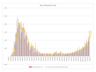
New infections state wide are approaching the previous peak
As they are county wide.
But total deaths are low as noted above.
Yet we still see LTC deaths. Also one must remember the data is very noisy so the numbers may be wrong as well as the dates.
Finally we have the infections per PoP per county. The hot spots are Essex, Union, Hudson, Passaic, Camden and Atlantic. Focus, focus, focus, use a scalpel not a hammer.


